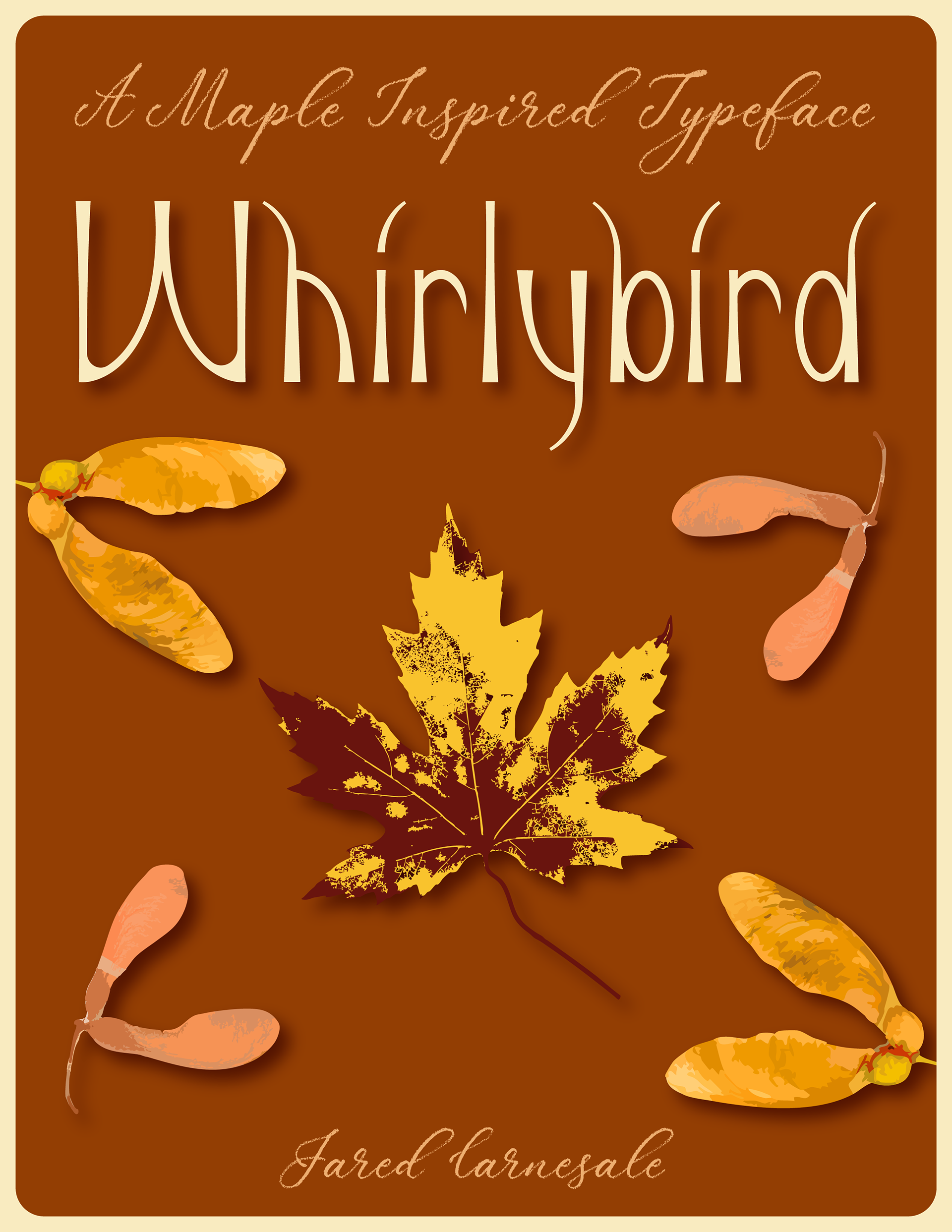
Project Brief
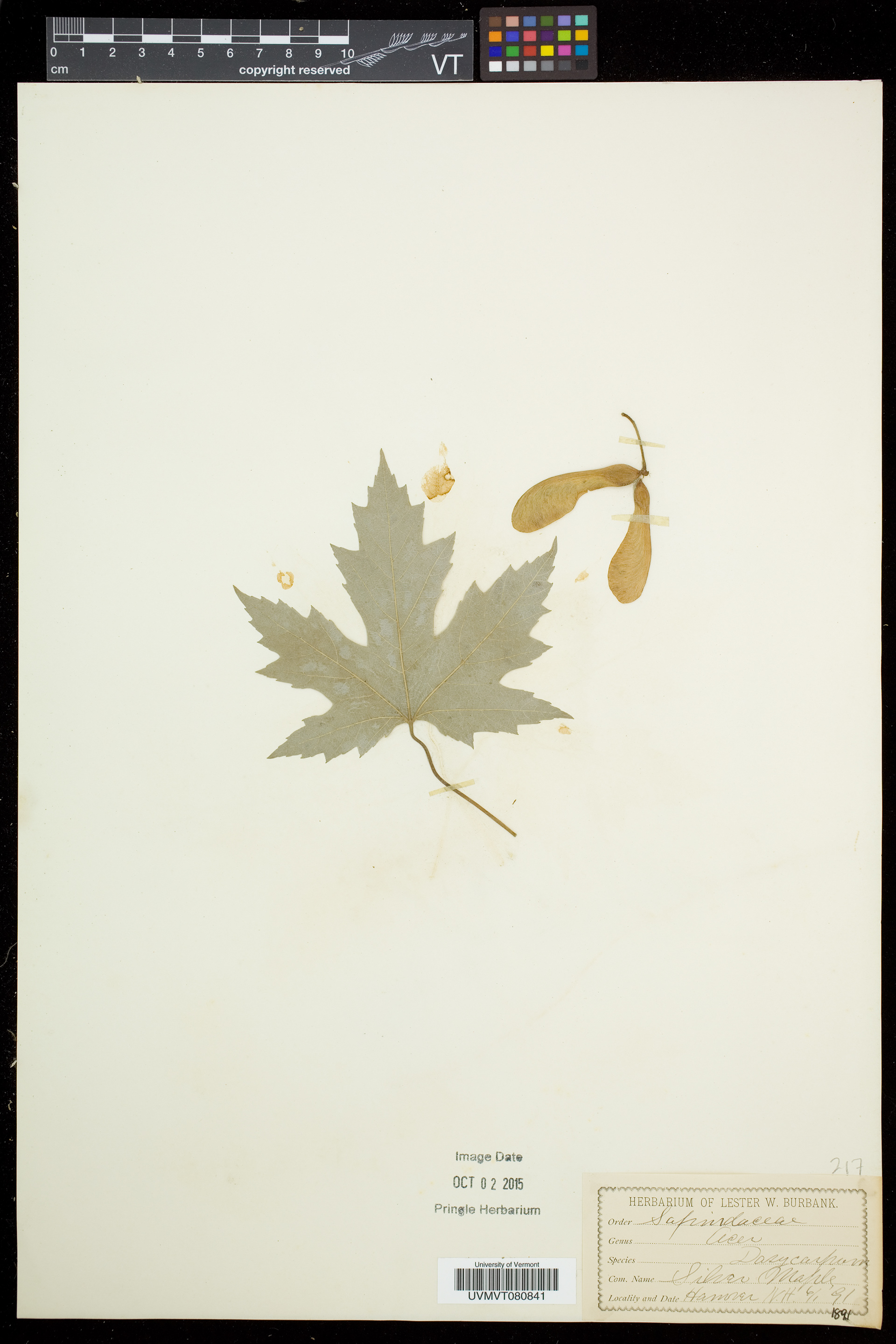
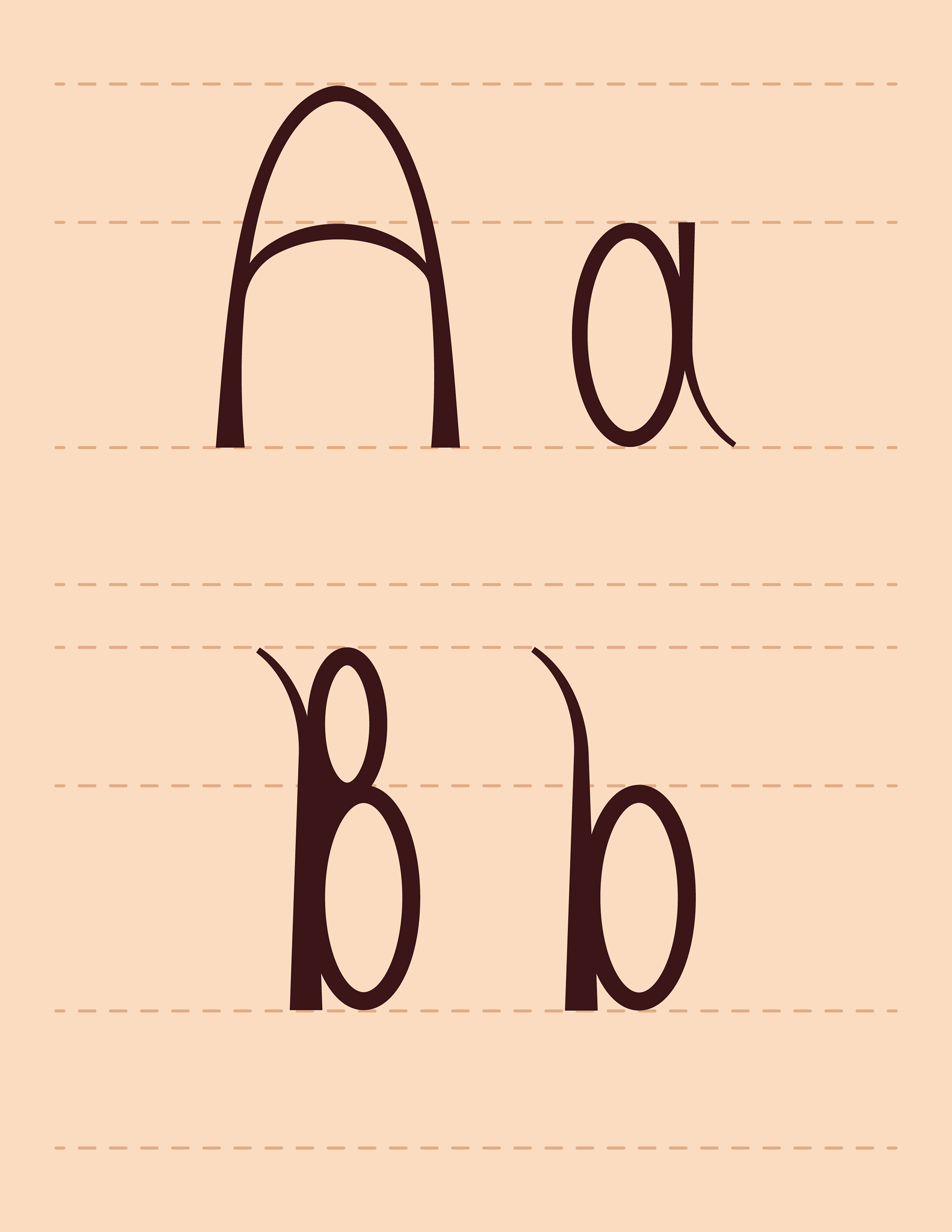
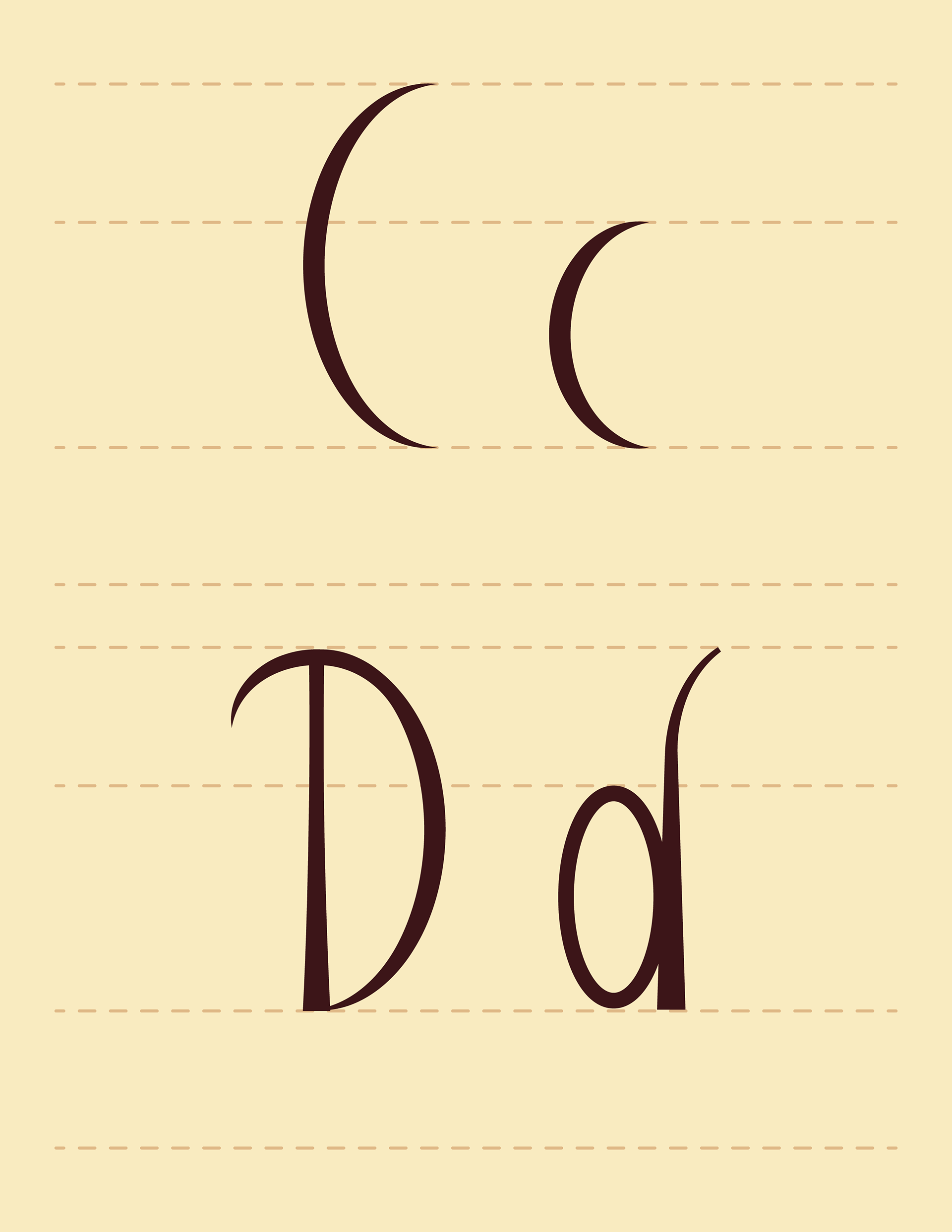
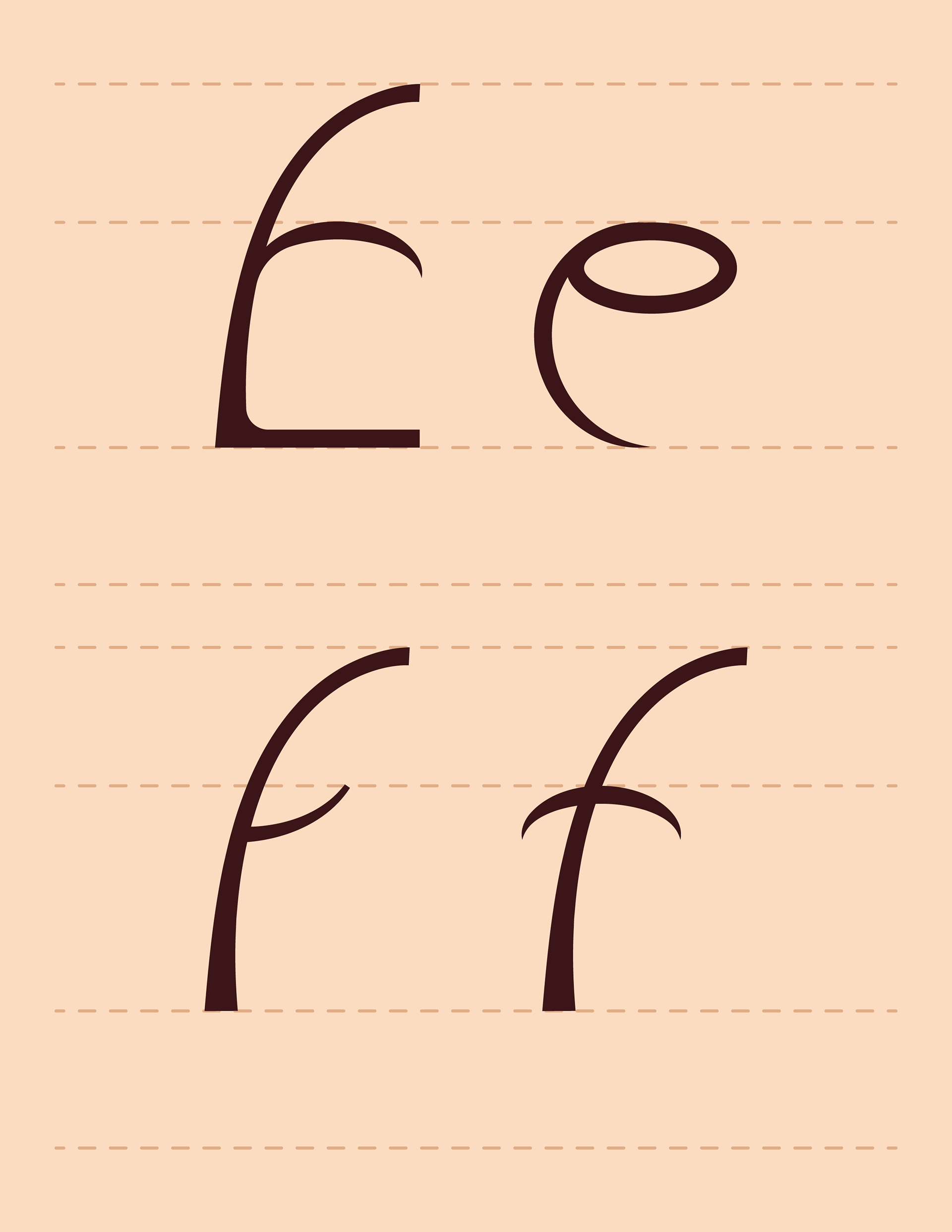
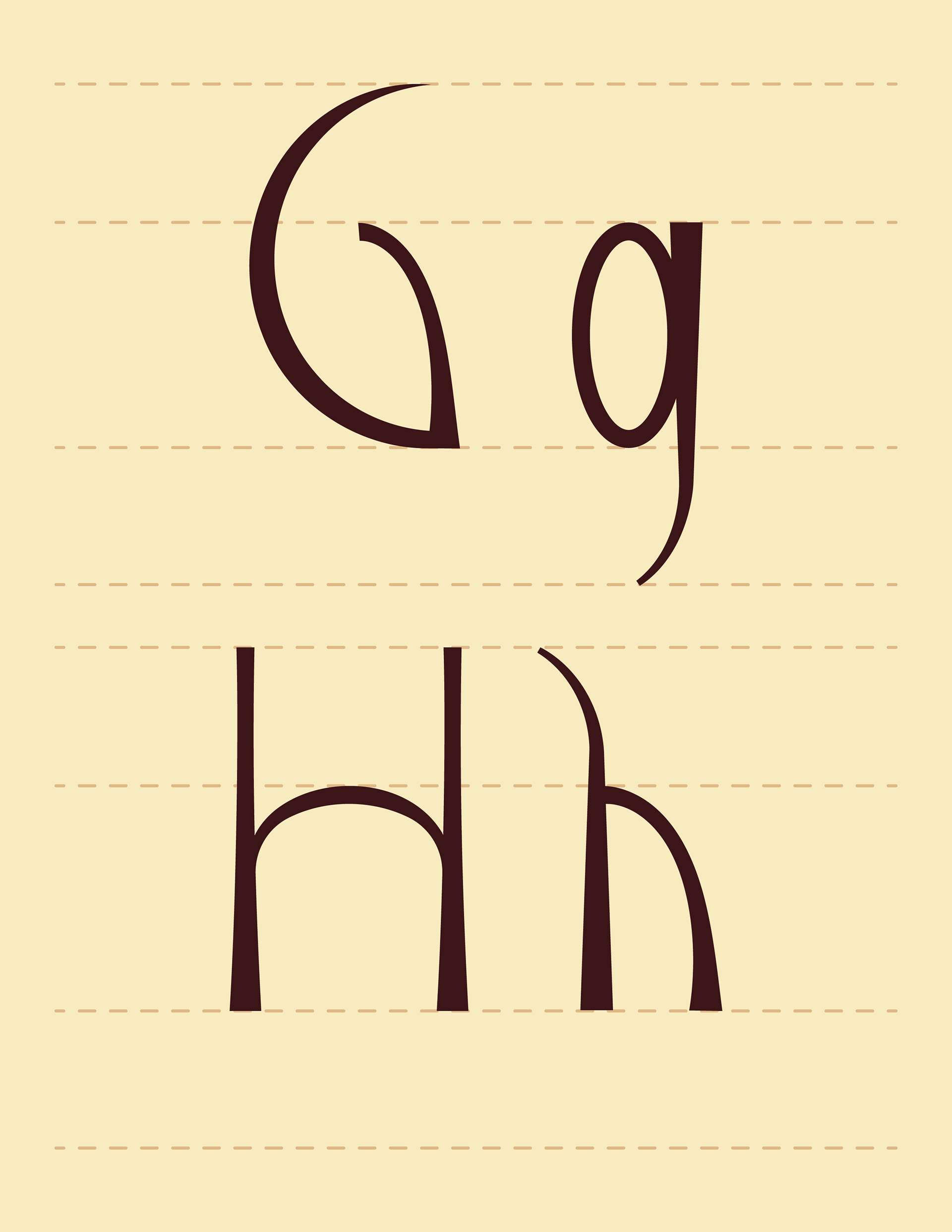
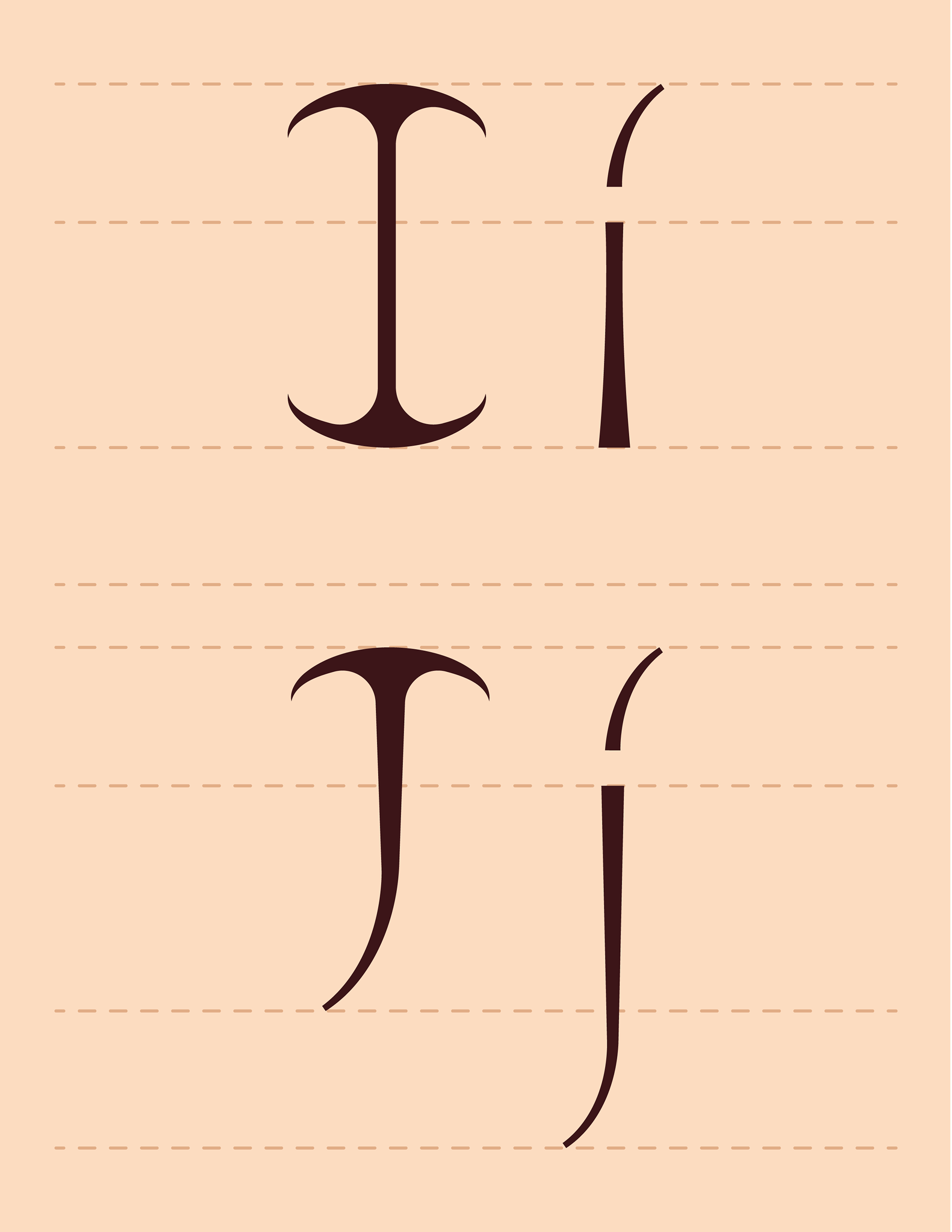
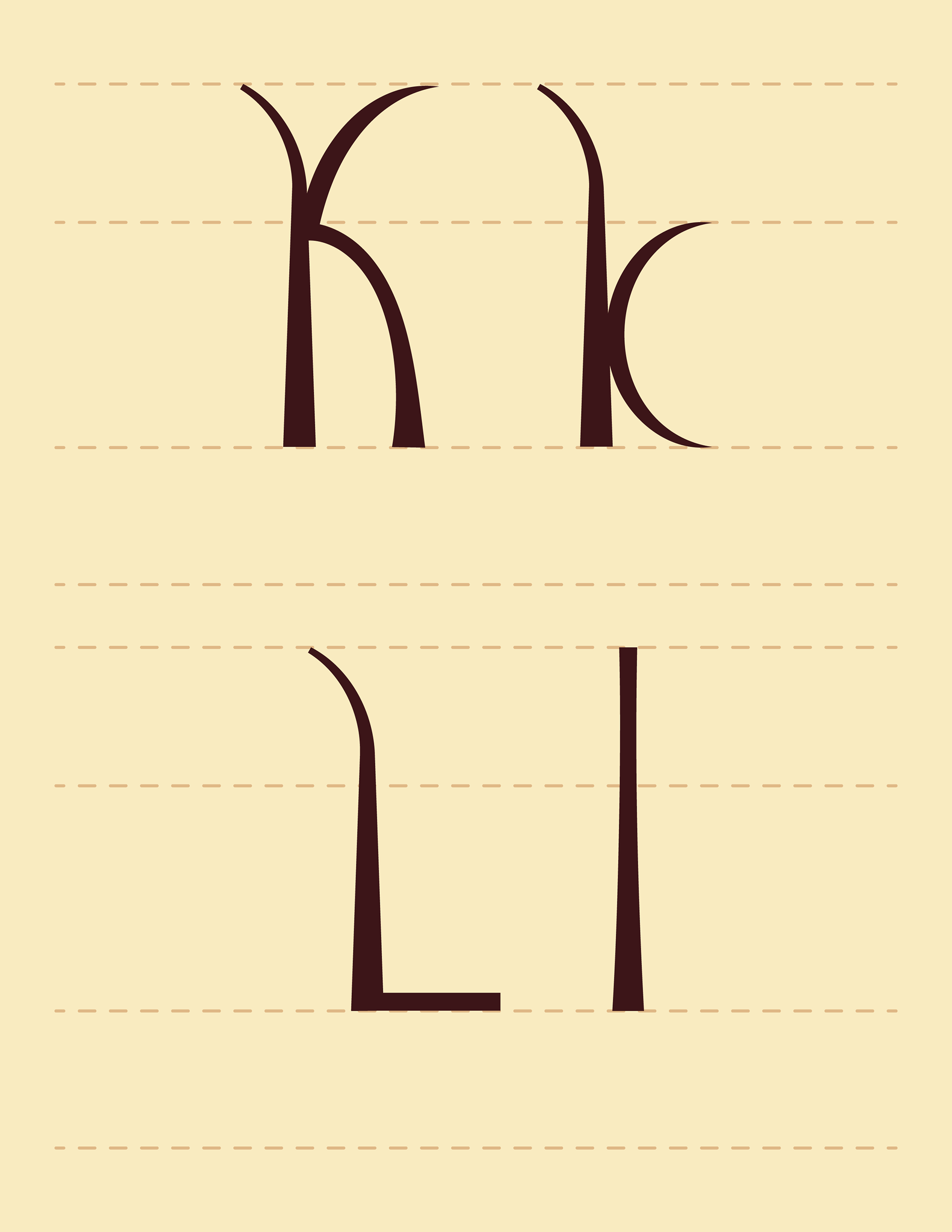
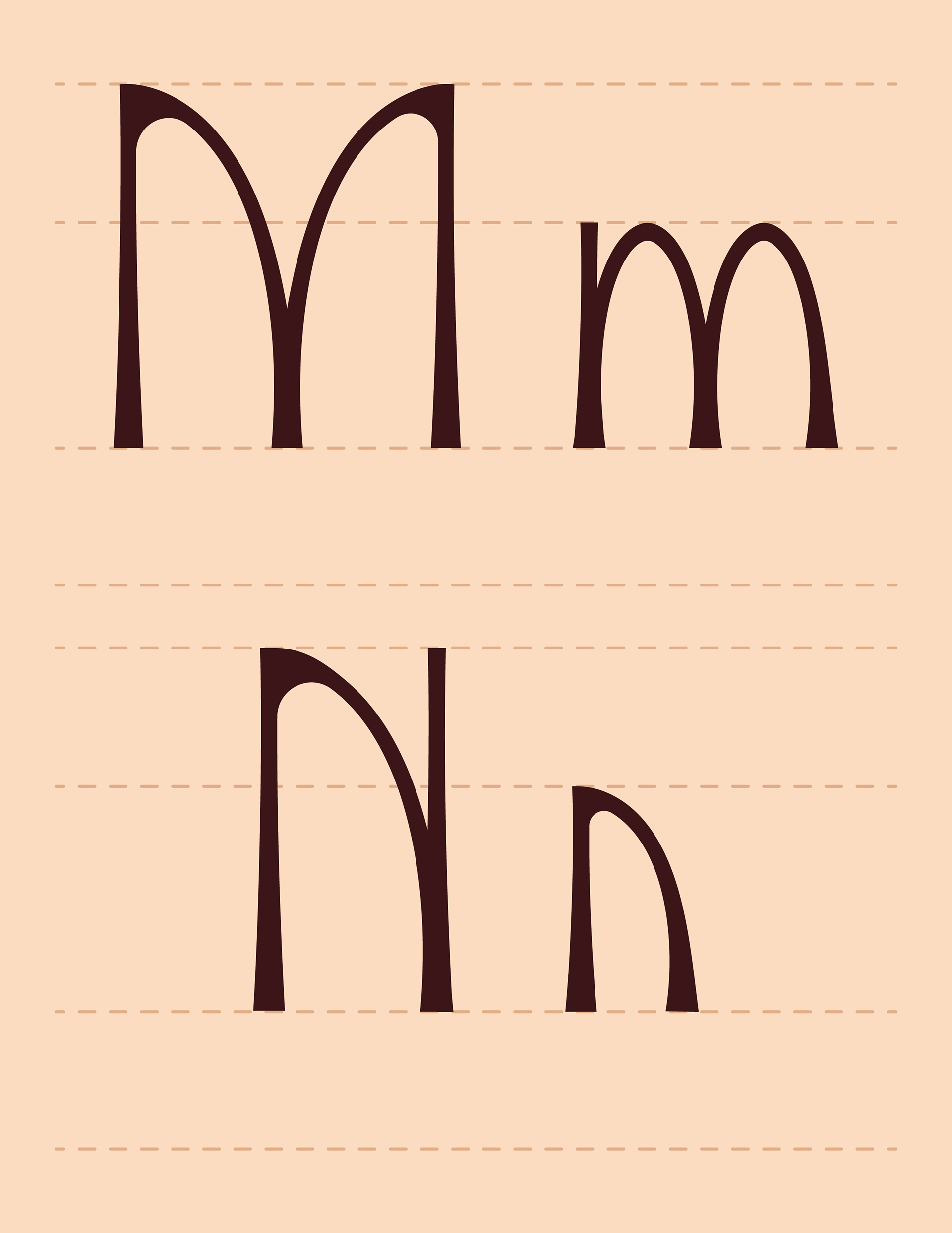
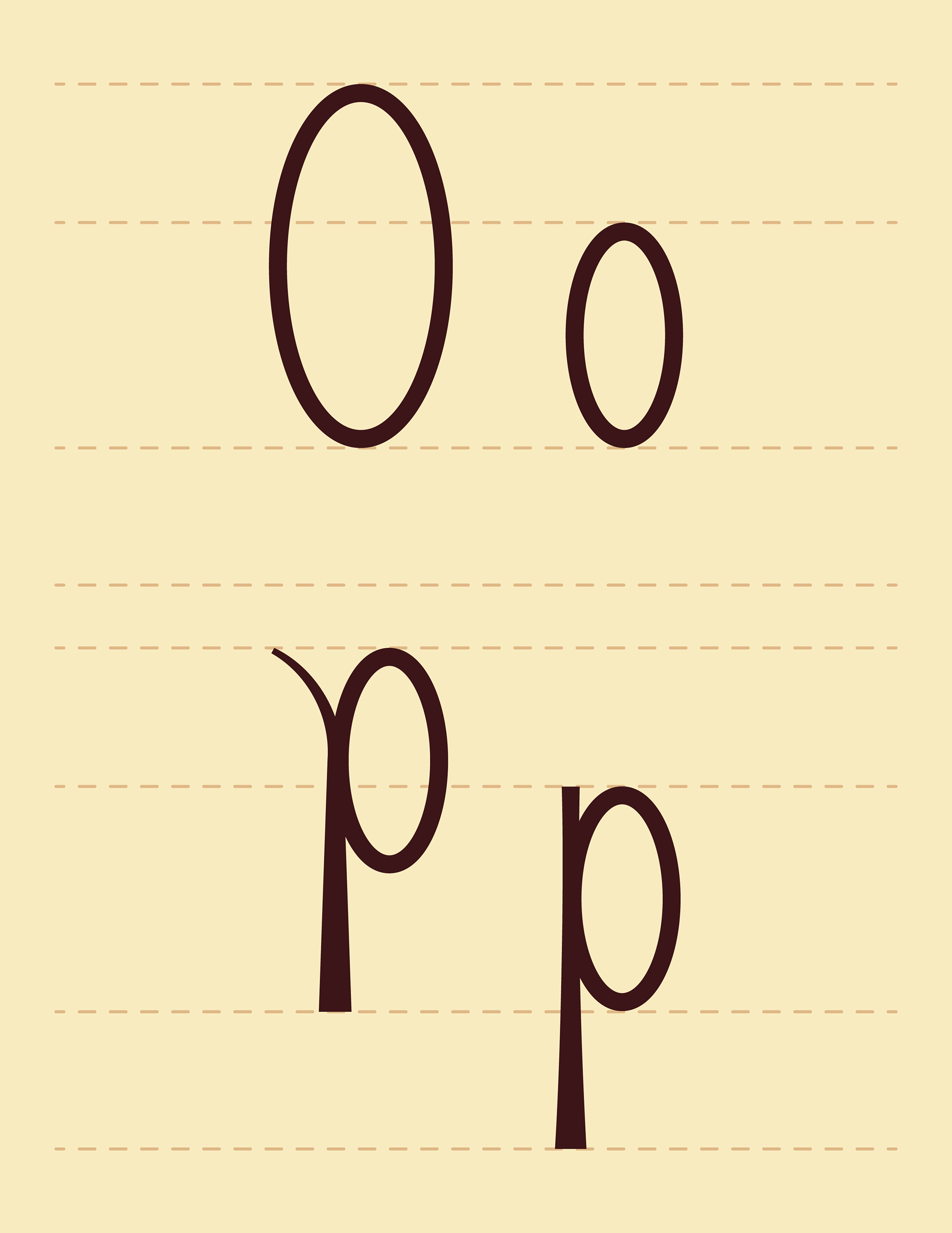
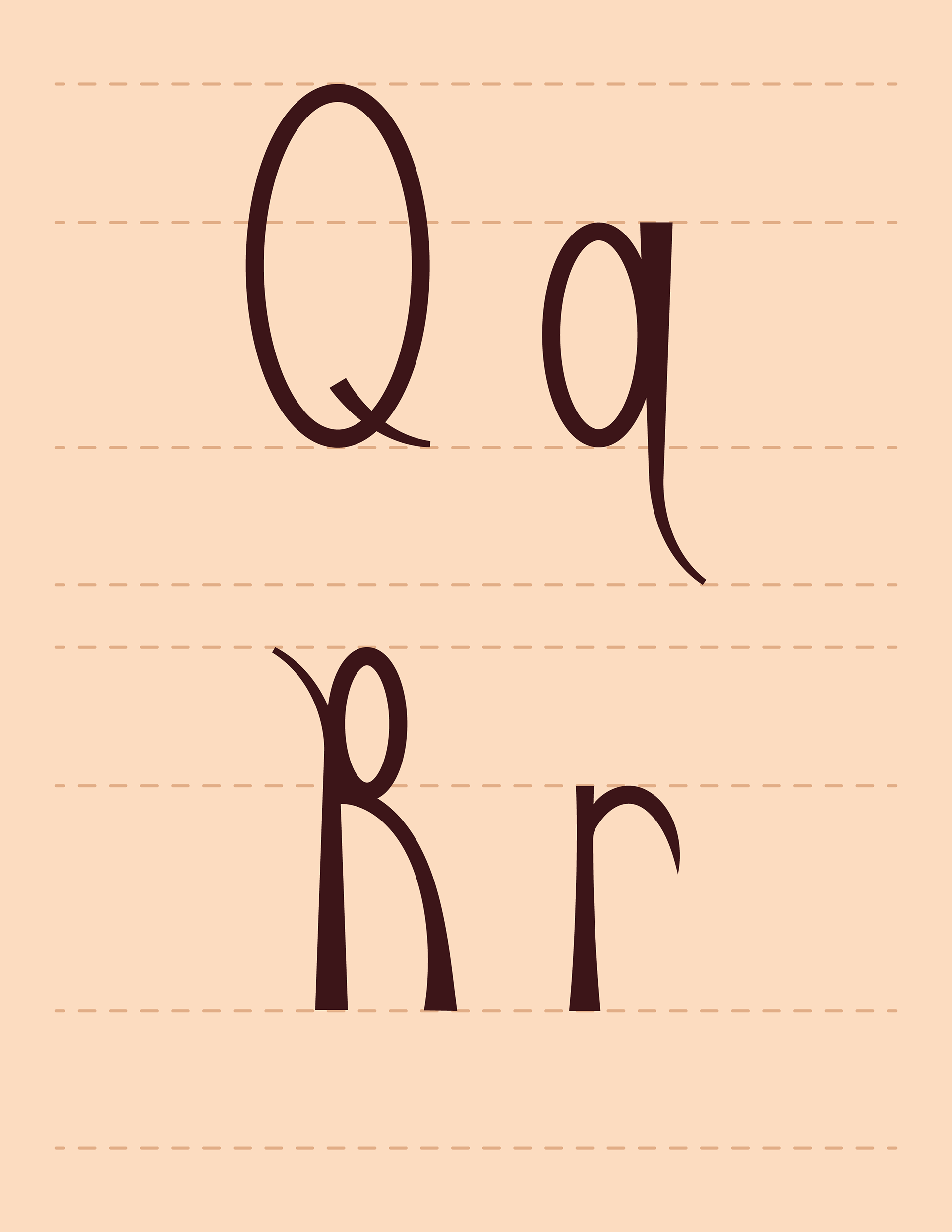
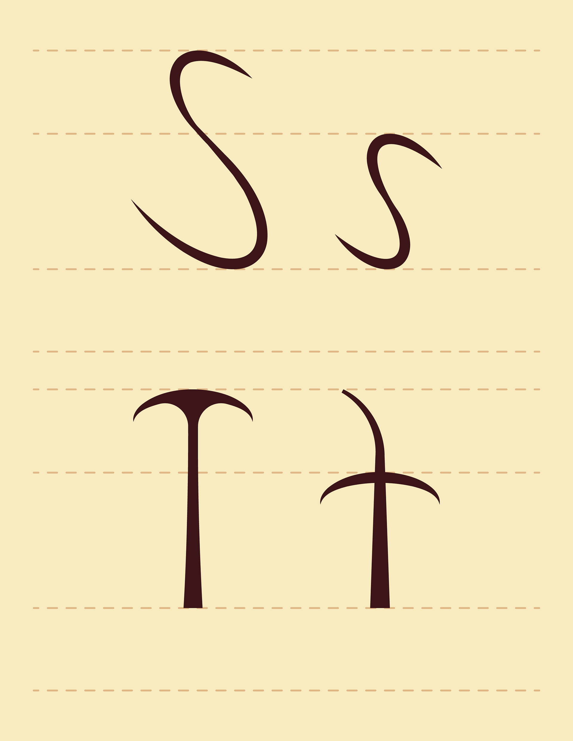
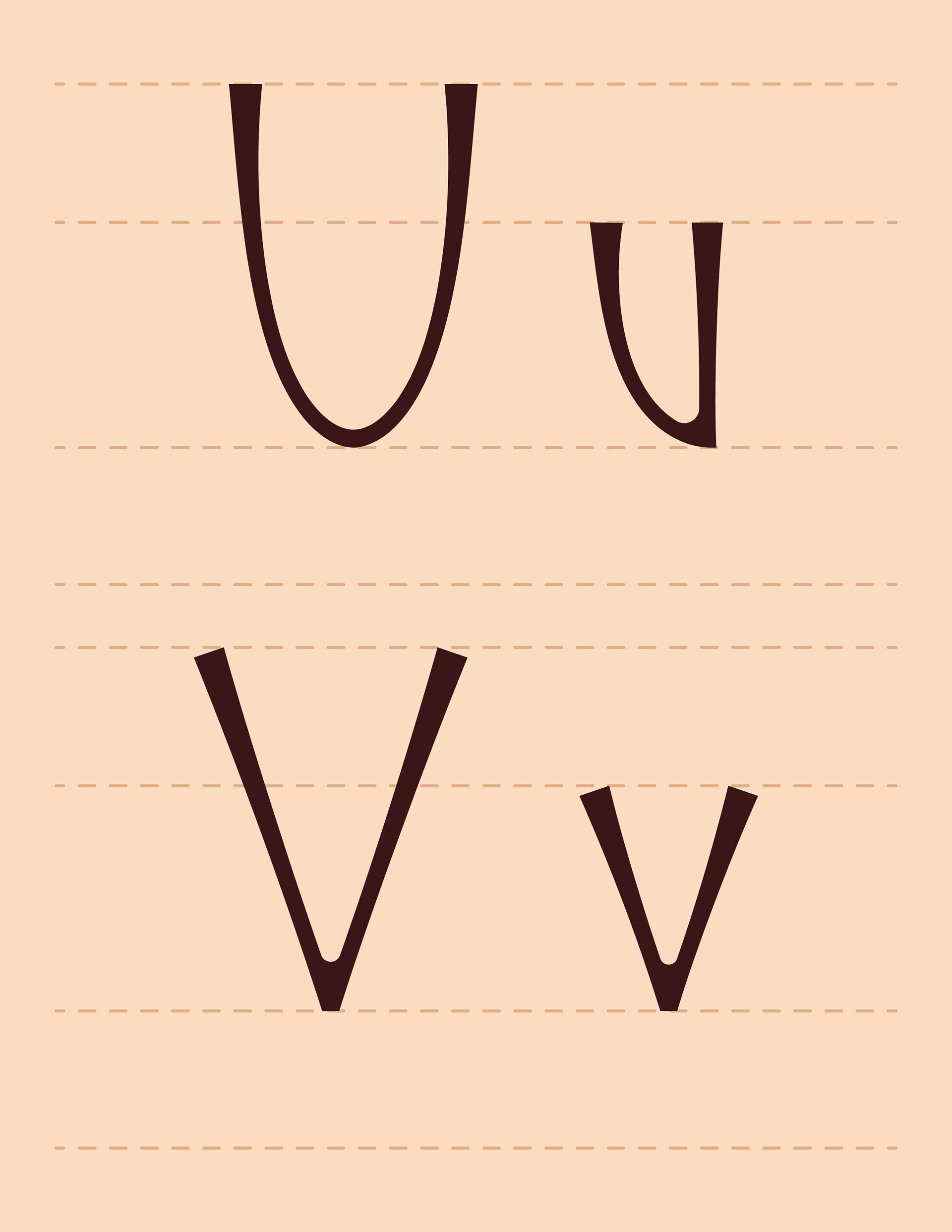
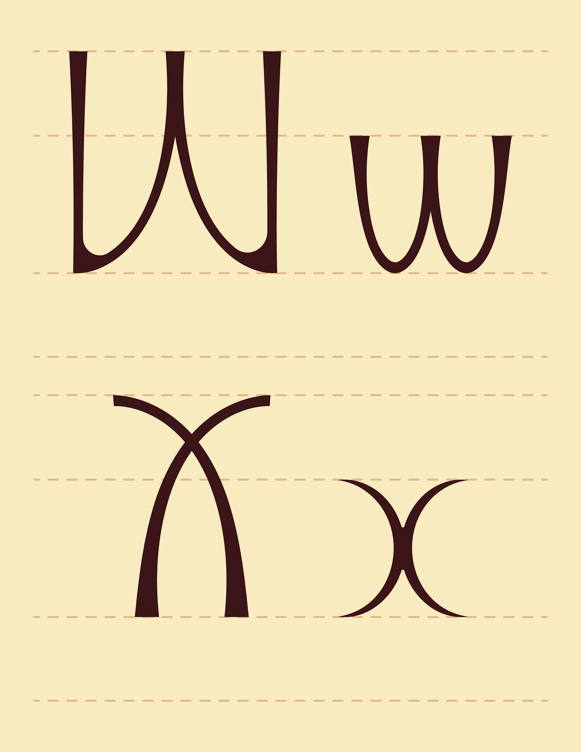
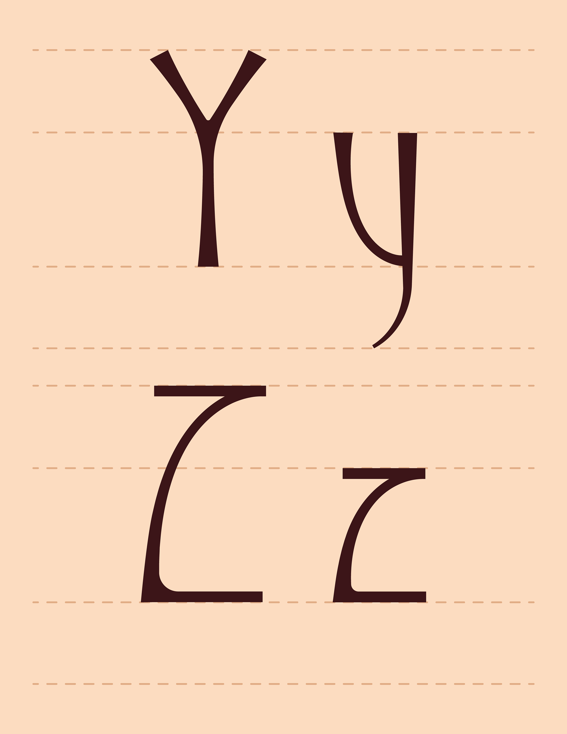
This project involved designing a custom A–Z typeface inspired by ecological observation, culminating in a digital booklet. I began by studying plant specimens at the Pringle Herbarium on the University of Vermont campus, documenting a selected species (Silver Maple) through photography, sketches, and notes focused on shape, line, and natural structure. Using these observations, I developed a cohesive type system that translated organic forms into letterforms, considering elements such as weight, proportion, ascenders, descenders, and overall consistency. The final typeface, including both uppercase and lowercase alphabets and a pangram, was constructed and refined digitally, then presented in a thoughtfully designed booklet that connected typography, ecology, and place.
Preface page reads:
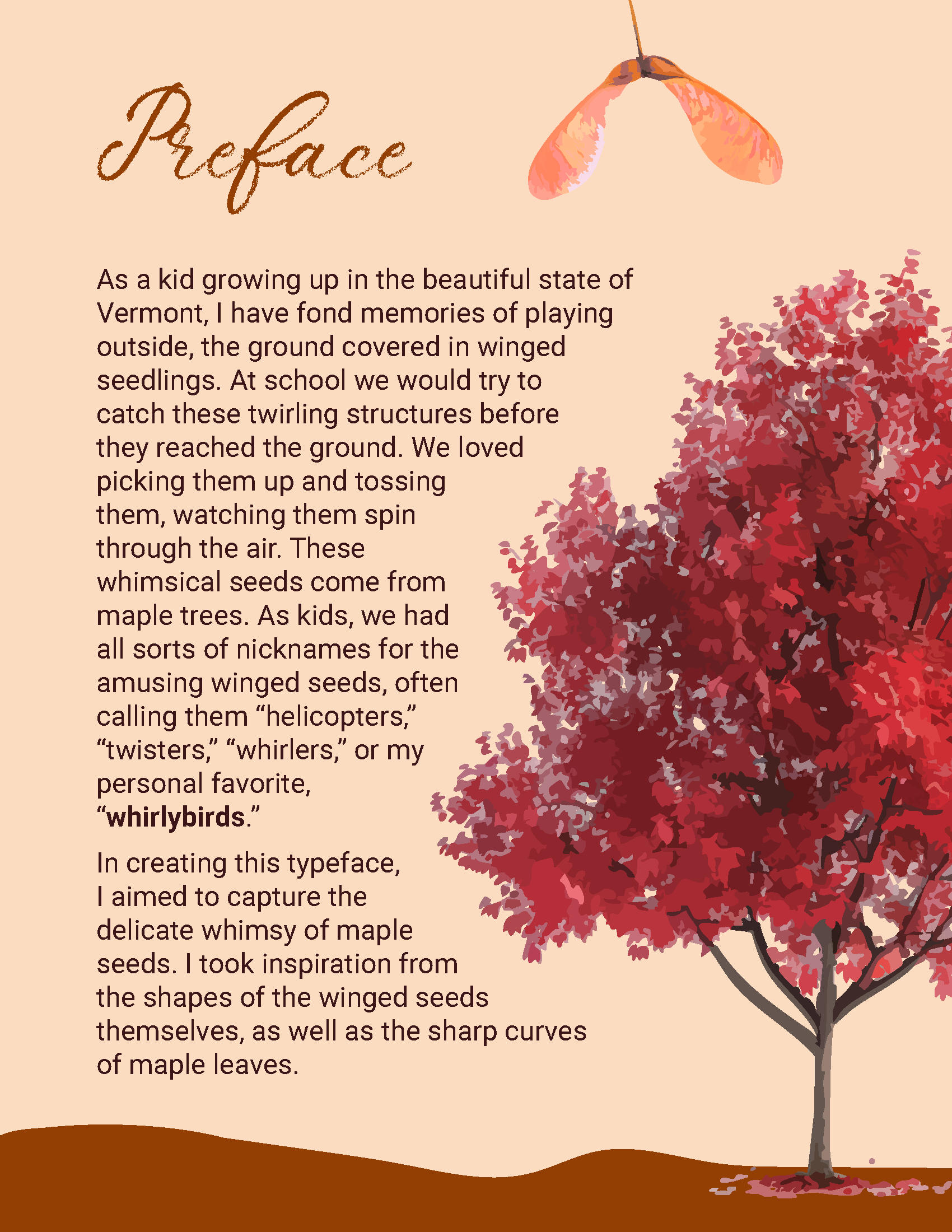
As a kid growing up in the beautiful state of Vermont, I have fond memories of playing outside, the ground covered in winged seedlings. At school we would try to catch these twirling structures before they reached the ground. We loved picking them up and tossing them, watching them spin through the air. These whimsical seeds come from maple trees. As kids, we had all sorts of nicknames for the amusing winged seeds, often calling them “helicopters,” “twisters,” “whirlers,” or my personal favorite, “whirlybirds.” In creating this typeface, I aimed to capture the delicate whimsy of maple seeds. I took inspiration from the shapes of the winged seeds themselves, as well as the sharp curves of maple leaves.
As a kid growing up in the beautiful state of Vermont, I have fond memories of playing outside, the ground covered in winged seedlings. At school we would try to catch these twirling structures before they reached the ground. We loved picking them up and tossing them, watching them spin through the air. These whimsical seeds come from maple trees. As kids, we had all sorts of nicknames for the amusing winged seeds, often calling them “helicopters,” “twisters,” “whirlers,” or my personal favorite, “whirlybirds.” In creating this typeface, I aimed to capture the delicate whimsy of maple seeds. I took inspiration from the shapes of the winged seeds themselves, as well as the sharp curves of maple leaves.
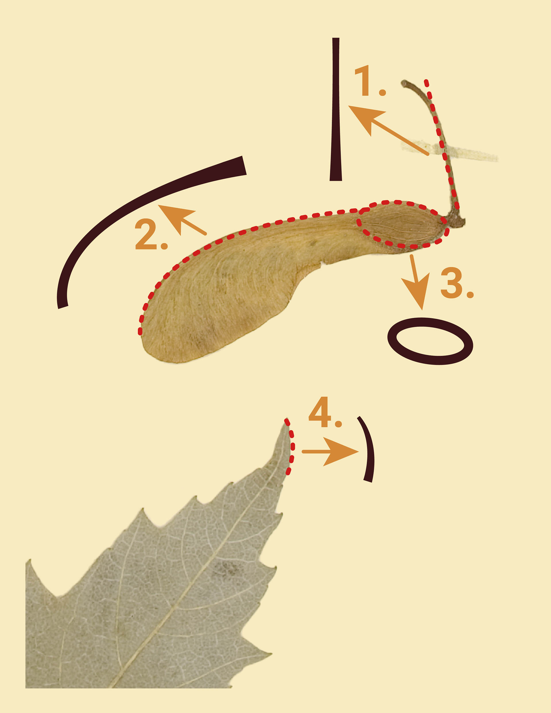
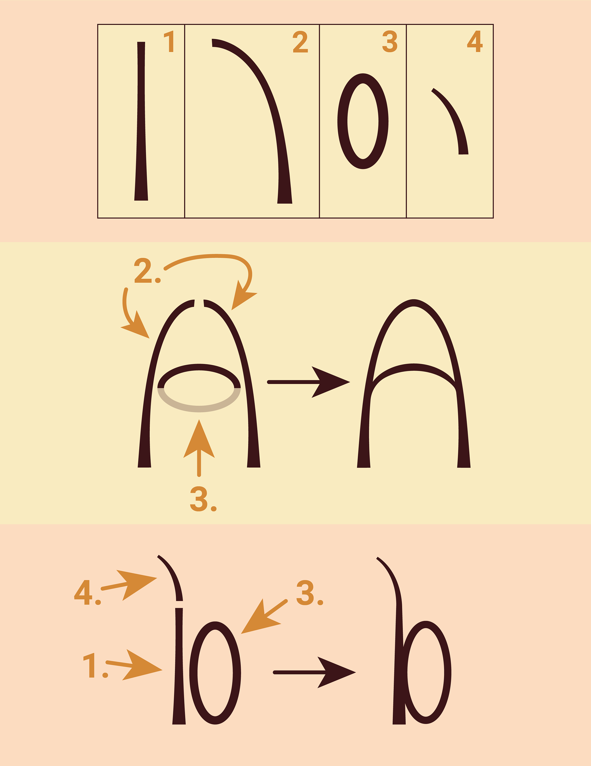

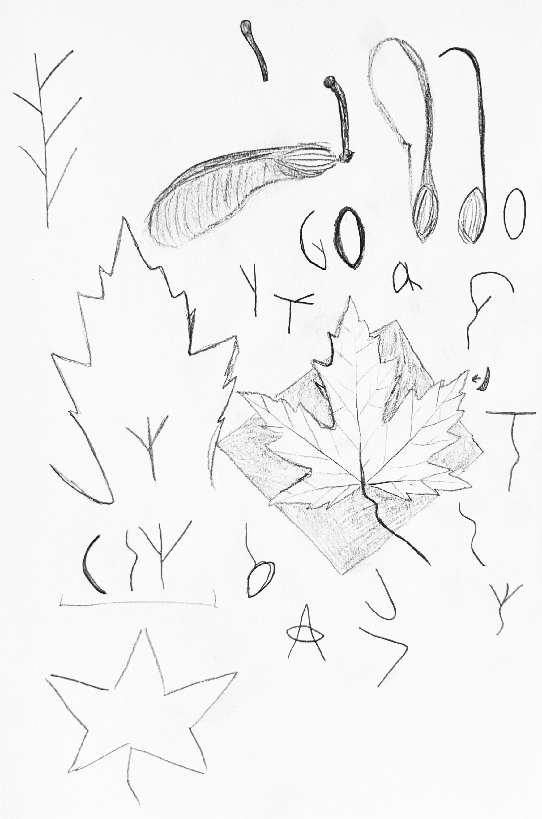
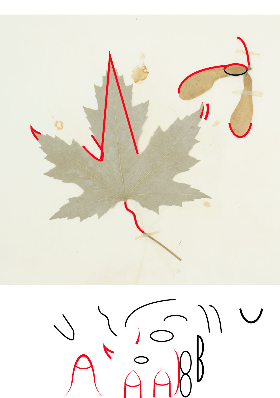
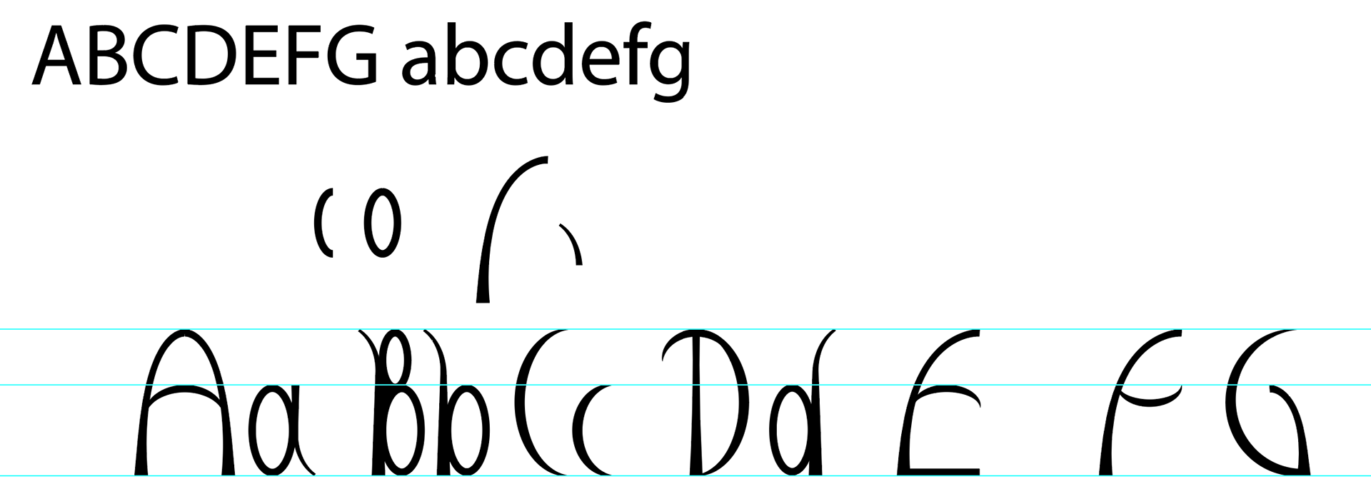
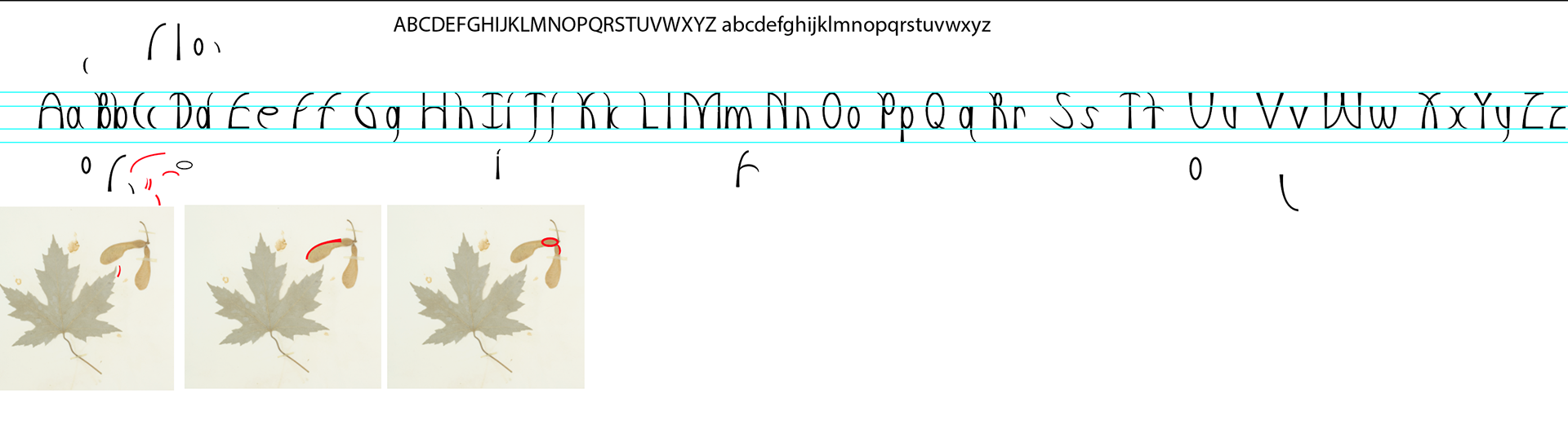
Ideation & Process